Massachusetts Bay Transportation Authority System Map
DATE: 1992-present
CLIENT: MBTA
AWARDS: Massachusetts Pride in Performance (1992)
Best Large System Map–Federal Transit Administration (2011)
The Challenge
To create the country's (USA) first digital transit system map.
Development
Prior to 1992 the MBTA produced all of their maps by hand using the archaic "paste up" method. In addition, each department was responsible for their own maps, creating vast inconsistencies. I proposed creating one all-encompassing digital map that could then be used by various MBTA departments; rapid transit, commuter rail and bus operations. This proposal was initially rebuffed, but after many presentations given to board members and senior managers, I received complete funding for the project. Note: at the time this was very cutting edge and during the early years of the desktop revolution when computer processors were very limiting and slow.
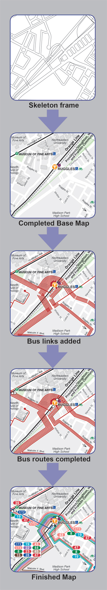
Phase One involved creating a base map to put all of the MBTA services onto. Luckily, the previous year, I had developed an Autocad base map that contained every street, street name, and transit line in the Boston metropolitan area. This map was imported and used as a foundation.
Phase Two involved drawing every bus route using "route descriptions" provide by the MBTA. This was a very time consuming process because early versions of the drawing software did not allow for offsetting lines. Each route had to be painstakingly drawn and made to look parallel with its companion route(s). Then a color was given to each route as well as its label.
Phase Three involved laying out the map out with all its other components and designing a fold that would complement them.
Lessons Learned
Choosing a color for each bus route was quite a challenge. Since the MBTA already had four colors being used for its transit lines (red, blue, green and orange), choosing unique but complimentary colors was an education. Not wanting to overwhelm the user I settled on eight colors to be used and reused where needed. This meant creating a map where the same two colored bus routes would never meet or be adjacent. I was almost 100% successful. There is only one place on the entire map where two similar colored bus routes cross each other.
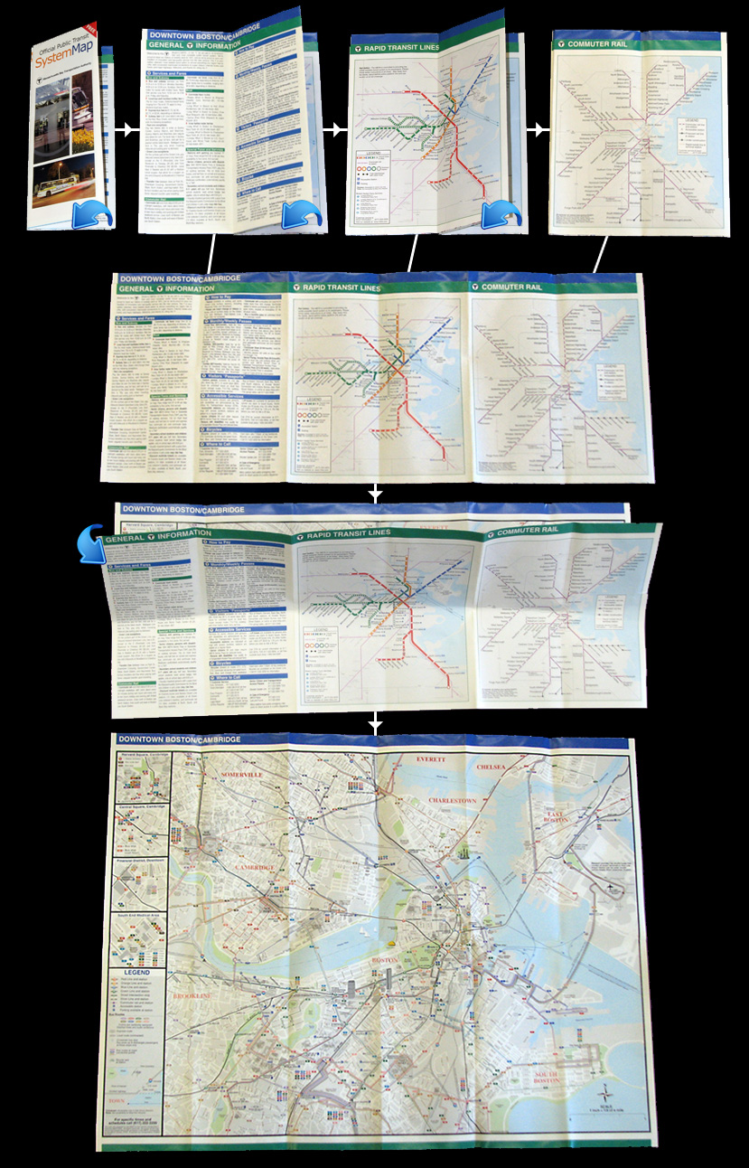
Early iterations of this map treated the final product like a poster. Feedback from riders informed me that the fold had to be altered so as too not treat the map as a wall poster, but as a product often used on crowded transit vehicles. After much trail-and-error, along with some amateur Usability Testing, I developed a revolutionary new fold that allowed riders to keep the map as small as possible, allowing its ease of use on crowded transit vehicles. See below.